Of course, you are in the unique position to bring that idea to fruitionBrianJamesFreeman wrote:I've always thought that would be a neat idea, too.TheCollector wrote:You know what I think would be really neat Brian? If there was some way to differentiate the added text in the uncut version from the original 1978 release. For example the added uncut text in Red, sort of how some bibles show where Jesus is speaking directly in red....Hope that makes sense.
I've always been curious exactly what was added, but never had the time to sit down and put each book side by side to document the changes. I don't know any edition that has tried.
Brian
Anniversary editions annouced by Cemetery Dance
-
TheCollector

- Site Admin
- Posts: 1995
- Joined: Wed Feb 20, 2008 4:00 pm
- Location: West Coast
- Contact:
Re: Anniversary editions annouced by Cemetery Dance
-
doktordru
- Posts: 45
- Joined: Fri Feb 29, 2008 1:16 pm
Re: Anniversary editions annouced by Cemetery Dance
Wow, that would be super cool, sure gets my vote!TheCollector wrote:Of course, you are in the unique position to bring that idea to fruitionBrianJamesFreeman wrote:I've always thought that would be a neat idea, too.TheCollector wrote:You know what I think would be really neat Brian? If there was some way to differentiate the added text in the uncut version from the original 1978 release. For example the added uncut text in Red, sort of how some bibles show where Jesus is speaking directly in red....Hope that makes sense.
I've always been curious exactly what was added, but never had the time to sit down and put each book side by side to document the changes. I don't know any edition that has tried.
Brian
Andrew
-
TrueNorth

- Posts: 176
- Joined: Fri Jan 03, 2014 8:12 am
- Location: Canada
- Contact:
Re: Anniversary editions annouced by Cemetery Dance
You know what I think would be really neat Brian? If there was some way to differentiate the added text in the uncut version from the original 1978 release. For example the added uncut text in Red, sort of how some bibles show where Jesus is speaking directly in red....Hope that makes sense.
I've always been curious exactly what was added, but never had the time to sit down and put each book side by side to document the changes. I don't know any edition that has tried.[/quote]
This is an out of the park idea.....I see why you get the big bucks!
If not red perhaps use a bold or italic font? It would keep costs down and may flow better. Maybe red for the lettered edition and bold for the gift and numbered?
I love it!
-
Bob M
- Posts: 132
- Joined: Tue Jun 02, 2009 4:16 am
Re: Anniversary editions annouced by Cemetery Dance
What a great idea. I would be in for buying one of these.
Bob
Bob
-
sandler77
- Posts: 10
- Joined: Thu Apr 17, 2014 10:05 am
Re: Anniversary editions annouced by Cemetery Dance
Great idea. I believe I have a copy of The Neverending Story, which is printed in two colors. One color is the story of the main character, and when he reads the large book in the story, the actual story itself is printed in another color. Pretty cool read with this printing. It would be great to see this again. Maybe Brian at CD can use his powers to make this happen!!!
-
BrianJamesFreeman
- Posts: 68
- Joined: Wed Apr 17, 2013 5:15 am
Re: Anniversary editions annouced by Cemetery Dance
Small production update/plan change for Carrie I wanted to note. At today's production meeting, we decided to go with full color illustrated endpapers for the Numbered Artist Edition. They'll look really sharp with the cover artwork for the AE, which we've now seen a preliminary version of and think our collectors will really like. We'll post the AE cover artwork once we have the final version all designed, so probably in two or three weeks.
Brian Freeman
Cemetery Dance Publications
Brian Freeman
Cemetery Dance Publications
-
Mr. Rabbit Trick
- Posts: 674
- Joined: Tue Mar 04, 2008 4:27 am
- Location: Scotland
Re: Anniversary editions annouced by Cemetery Dance
It should be pointed out that even though the advertisement says, "originally published by Doubleday back in the 1970s and early 1980s", The Stand will be the "Complete and Ucut" version from 1990.
So its not the original Stand.
So its not the original Stand.
-
BrianJamesFreeman
- Posts: 68
- Joined: Wed Apr 17, 2013 5:15 am
Re: Anniversary editions annouced by Cemetery Dance
A sneak preview of the production update we're emailing to the CARRIE customers today. Here's the cover for the Numbered Artist Edition:
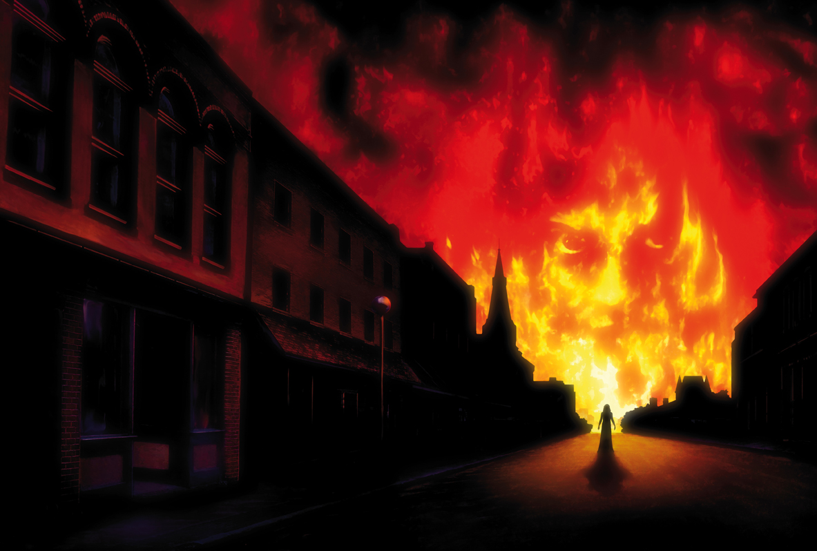
Brian
Brian
-
jimimck

- Posts: 460
- Joined: Thu Apr 15, 2010 2:43 am
- Location: New Zealand
Re: Anniversary editions annouced by Cemetery Dance
Awesome.
And I hear you are going with a "no text" approach for the front cover?
And I hear you are going with a "no text" approach for the front cover?
-
BrianJamesFreeman
- Posts: 68
- Joined: Wed Apr 17, 2013 5:15 am
Re: Anniversary editions annouced by Cemetery Dance
Correct!jimimck wrote:Awesome.
And I hear you are going with a "no text" approach for the front cover?
Brian