|
|
Want to be notified about the latest news and updates?

|
|
Remarque Photos - Good and Bad
I want to start off by saying I will gratefully take ANY remarque photo you choose to share, and I thank you for doing so!! You're allowing countless other Stephen King fans to get a look at work that would otherwise not be available to them
I would like to give each fan the best viewing experience, over time I've received a lot of different photos, some great some not so great. I tweak each photo to make it the best I can but I can only do so much. I've found the things that make a good photo are:
- A clear photo
- Even white light
- Straight on shot
- A big picture - as long as you're not intentionally shrinking your photos the default your camera does is fine
I've added some samples of good and bad photos as examples. With a little blurb on what the problem is. Again I will gladly use anything you send me, but the closer you can look like the top two photos that would be ideal.
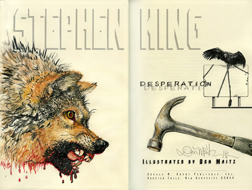
| Perfection! - Done on a professional scanner, super crisp, super straight. I don't expect this level of images from anyone but I'm thrilled when I get them! |
 |
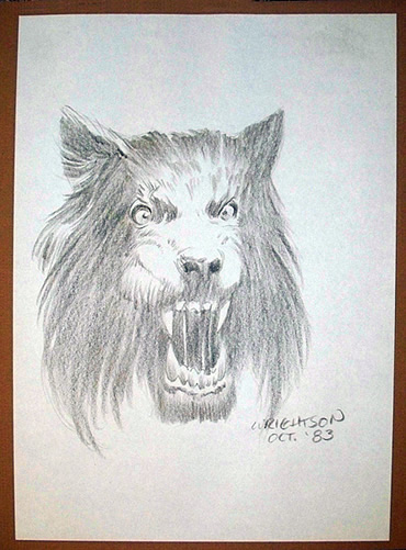
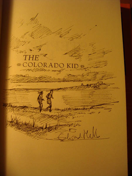
| Excellent photo! - Clear, a nice border for cropping, even tone, straight on shot and not blurry. These sorts of shots are great and easy to optimize and work with |
|
| Photo to blurry- I can compensate for some blurryness but at some point it's too much. Also, ideally there would be a little more space on the left and bottom so I can crop as needed. |
|
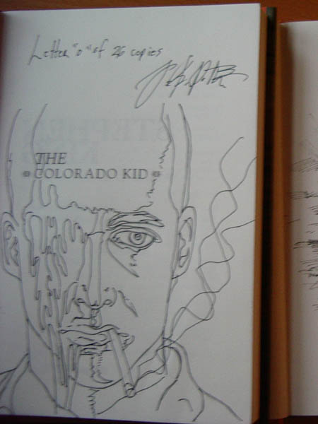
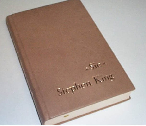
| Book at to much of an angle - The photo is nice and crisp but the picture was not taken straight on. When I crop it it won't appear straight. It's a little dark but I can correct for this level of darkness no problem. |
|
| Book at an angle and missing the corners - A different sort of Angle shot, even if I rotate it with photoshop I still won't have the entire book because the photo cuts off the corners of the book. it's also a bit to blurry |
|
| Harsh Shadow and to yellow - There's a deep shadow on the left side of the picture, it's very hard to even out the tone. Also it's so yellow that even with my corrections it's going to be hard to get the actual color back. |
|
| |
|
|